
Amazon Quick Sight is Amazon Quick’s business intelligence (BI) feature and integrated BI service. It offers modern interactive dashboards, natural language queries, pixel-perfect reports, machine learning (ML) insights, and built-in analytics at scale. Amazon Quick brings together AI agents for business insights, investigation, and automation into one unified experience, enabling you to work smarter and faster while maintaining security and access policies.
Today we are announcing sheet tooltips for Amazon Quick Sight. Dashboard authors can now design custom tooltip layouts using free-form layout sheets. These layouts combine charts, key performance indicator (KPI) metrics, text, and other visuals into a single tooltip that appears dynamically as readers move their mouse over data points. Sheet tooltips work with most chart types, including tables and pivot tables, and allow authors to reuse the same tooltip sheet across multiple visuals for a consistent experience. This feature gives you more control over how contextual information is displayed, allowing you to create richer data storytelling without taking readers away from the visuals they’re exploring.
Solution overview
Sheet tooltips allow you to:
- Design custom tooltip layouts using the free-form sheet editor
- Include multiple visual types within a single tooltip, such as line charts, bar charts, and text boxes.
- Displays dynamic real-time data that updates as the reader moves over different data points
- Add contextual metrics such as revenue, units sold, and total orders with trend visualizations
- Create visually rich tooltip experiences that go beyond text-based data labels.
- Enhance data storytelling by displaying supplemental insights on hover
This feature uses a dedicated tooltip sheet type with a free-form layout, giving you the flexibility to arrange visual components the way you want. The tooltip sheet supports up to five visuals and dynamically filters data based on the data point you hover over.
Prerequisites
Before you begin, make sure you have the following:
- An active AWS account with access to Amazon Quick Sight
- Quick Sight Enterprise Edition is enabled in your account
- Author or Author Pro access to create and manage analyzes and dashboards
- Basic knowledge of Quick Sight concepts such as analytics, dashboards, sheets, and visual types.
Get started with sheet tooltips
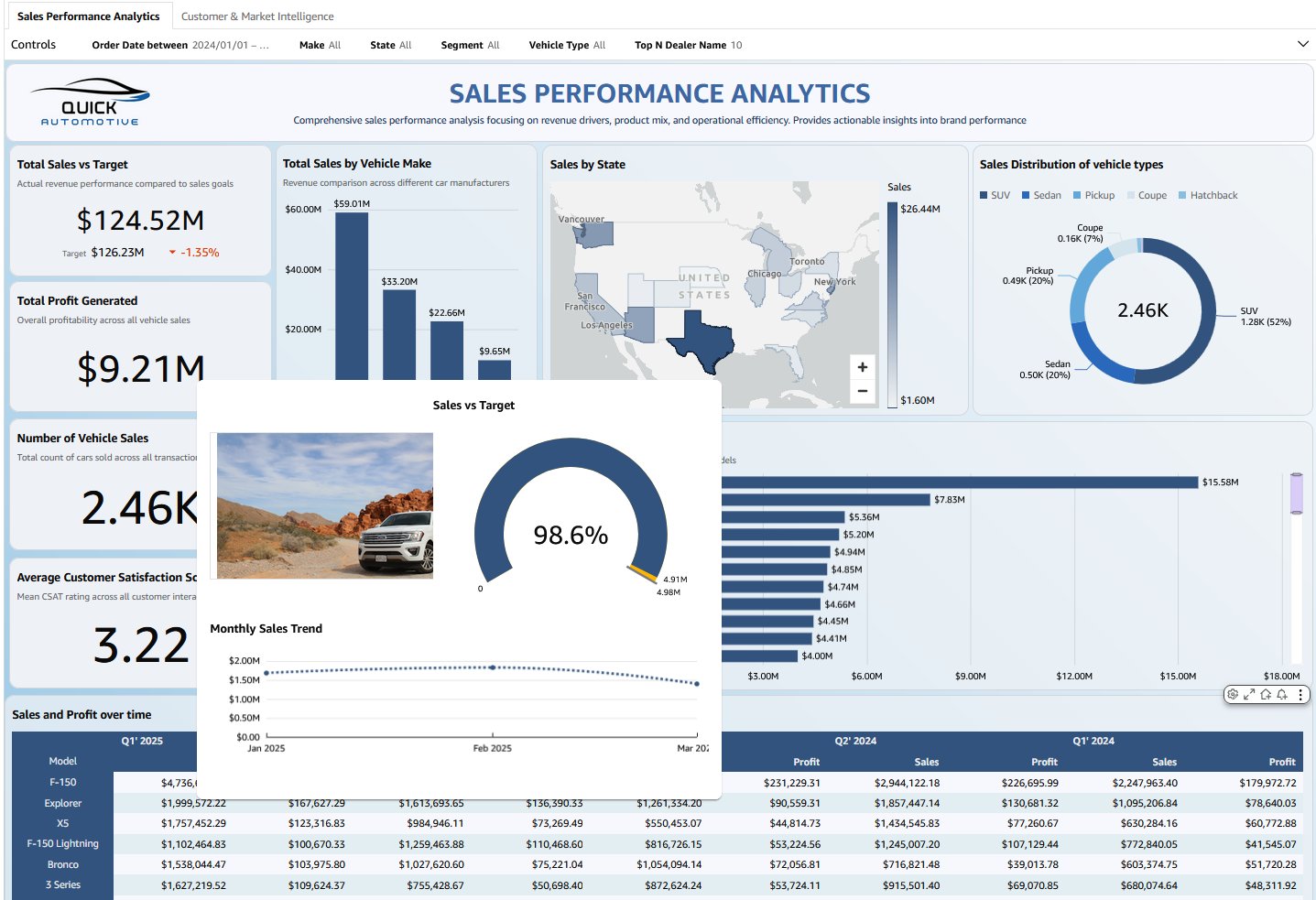
The following tutorial shows how to set sheet tooltips using the Sales Dashboard as an example. The same approach can be applied to any use case. Just replace the visuals and metrics related to your data.
To create a sheet tooltip for a quick site visual, follow these steps:
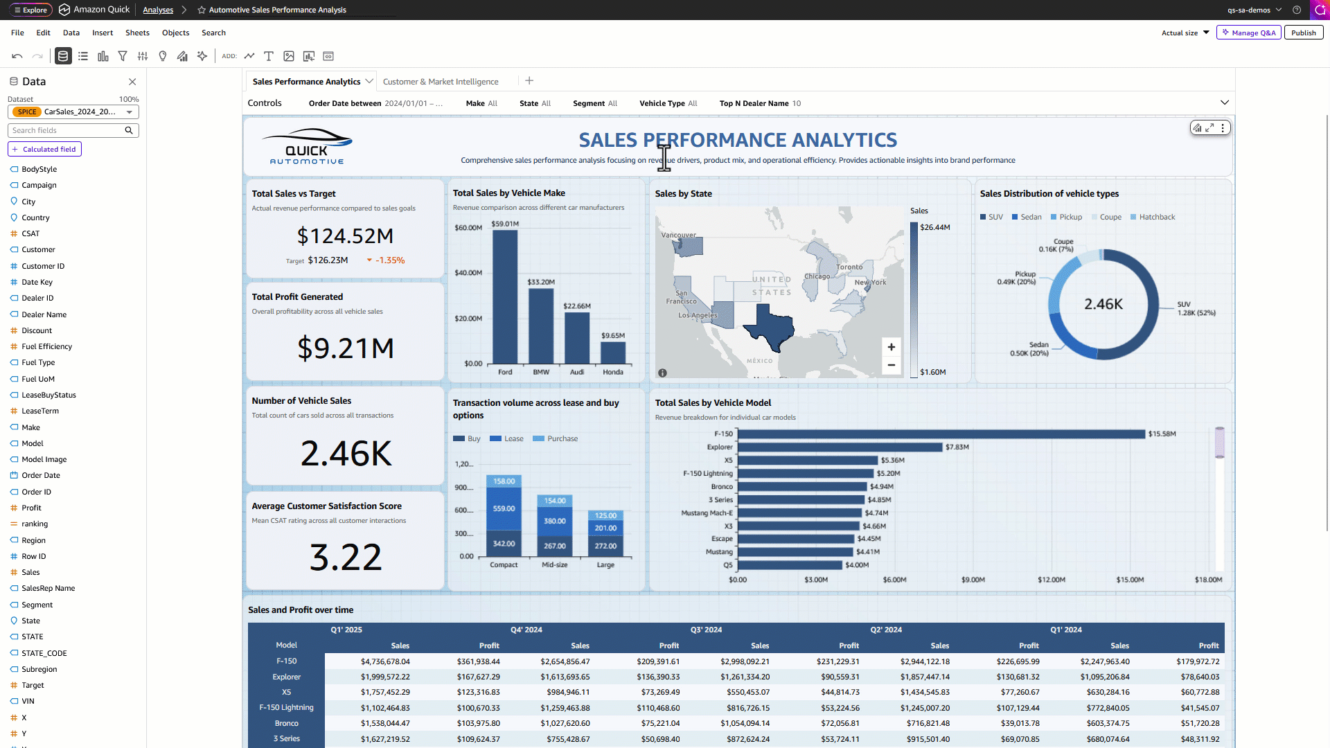
Step 1: Go to the Interactions tab.
- In the left pane of the Amazon Quick console, under Quick Sites, select Analytics.
- Select any visual (such as a bar chart or table) on the dashboard sheet and click[ビジュアルの編集]Select.
- in properties In the right panel, go to the Interactions tab.
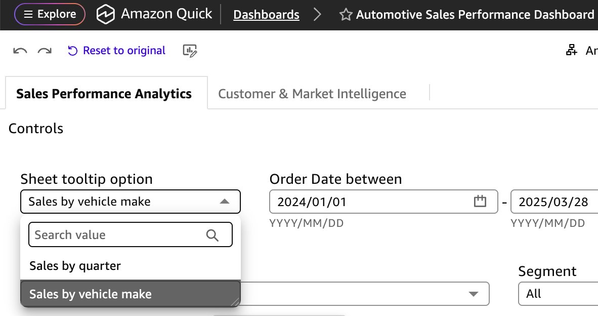
- under tool tip configuration, selection Sheet tooltip As shown in the following example.
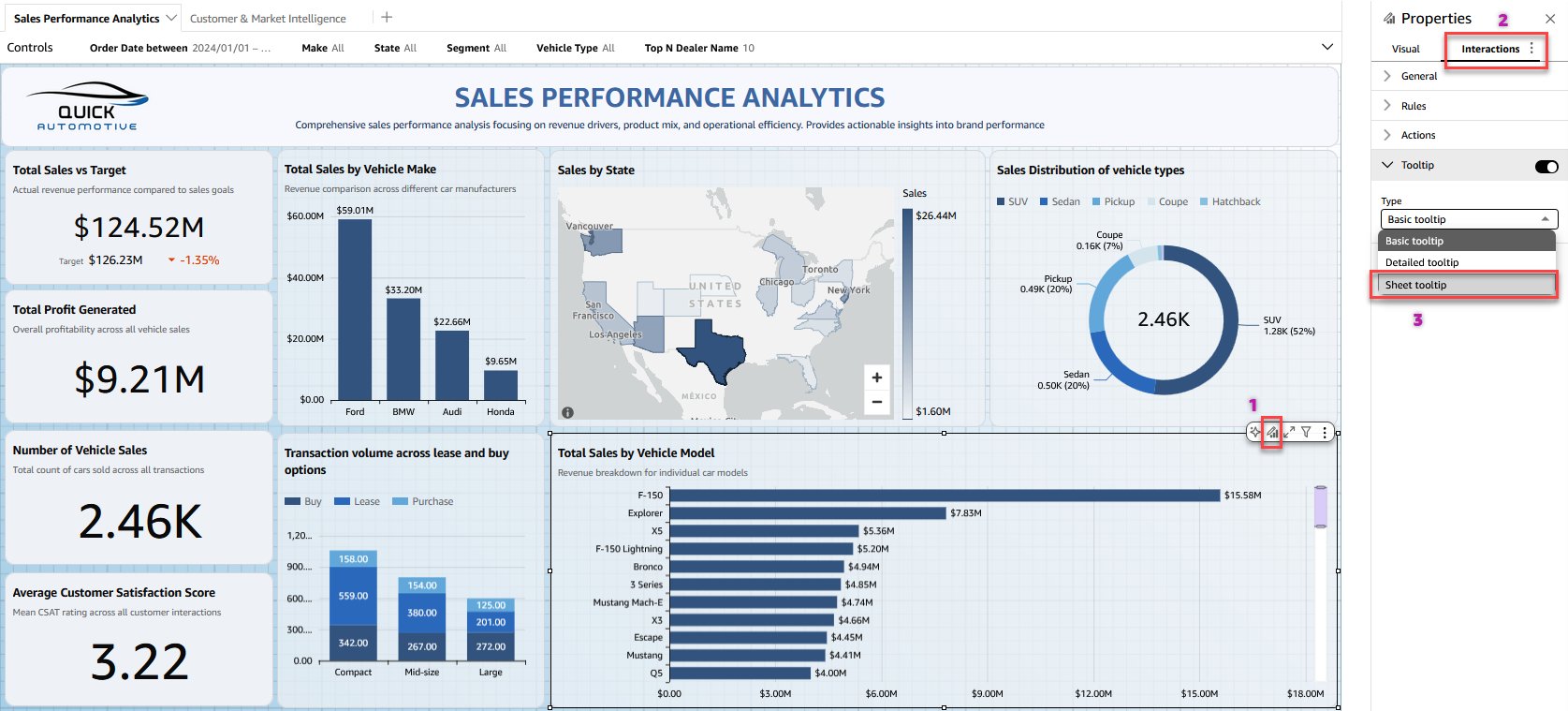
- choose Create a sheet tooltip Build for your use case.
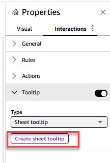
Step 2: Design and publish your tooltip sheet
- Quick Sight analysis opens new possibilities. tool tip A sheet with a free-form layout that provides a blank canvas for tooltip design. Add up to 5 visuals to the tooltip sheet. Resize and format to fit your layout
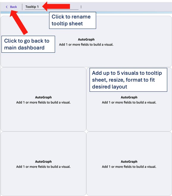
- After configuring your settings, return to the main dashboard sheet.
<Buttons in the top menu bar. - Hover your mouse over a data point on the visual to see a sheet tooltip rendered with your custom layout.
- As you move between different data points, tooltips dynamically update all visuals, text boxes, and metrics in real time, providing rich contextual information at a glance.
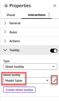
- To edit an existing tooltip sheet, select the sheet from the tooltip drop-down list, select the pencil icon, and make your changes.
- Finally, publish the dashboard so readers can use the tooltip.
Use case
Let’s take an example of creating a sales-focused sheet tooltip that includes three visuals. You can replace these with visuals and metrics that suit your use case.
- [ビジュアル]Drag visuals from the section onto the canvas and resize them to fit your layout.
- Rename the sheet tooltip as follows: model sale.
- Add gauge charts to measure sales against goals and view comparative percentages.
- Add a line chart to show monthly trends in sales.
- Now add a table and select the model image. Edit the field settings and set the field as follows: Display the URL as an image.
- Adjust the size and position of each visual element on the canvas. Free-form layout allows you to freely drag and reposition elements to create the tooltip configuration you prefer. Format the visual and check the results as shown in the following screenshot.
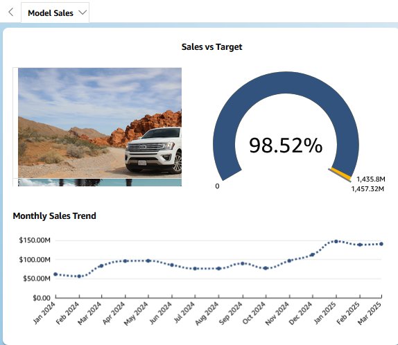
The following video shows an example of a tooltip for a car sales performance dashboard sheet that displays sales vs. target, monthly sales trends, and an image of the selected model when you hover over a model data point. The content of the tooltip varies based on the visuals and metrics you select for your specific use case.
Features supported by sheet tooltips
You can add sheet tooltips to most visual types in Quick Sight. The following list shows supported visual types.
| Visual types can include sheet tooltips | ||||
| gauge | donut chart | pie chart | past pie chart | vertical bar chart |
| Historical stacked bar chart | vertical stacked bar chart | Past accumulation 100% bar graph | Vertically stacked 100% bar chart | line graph |
| area line graph | stacked area line chart | grouped bar combination chart | stacked bar combo chart | boxplot |
| pivot table | table | heat map | tree map | scatter plot |
| histogram | funnel chart | points on the map | filled map | layered map |
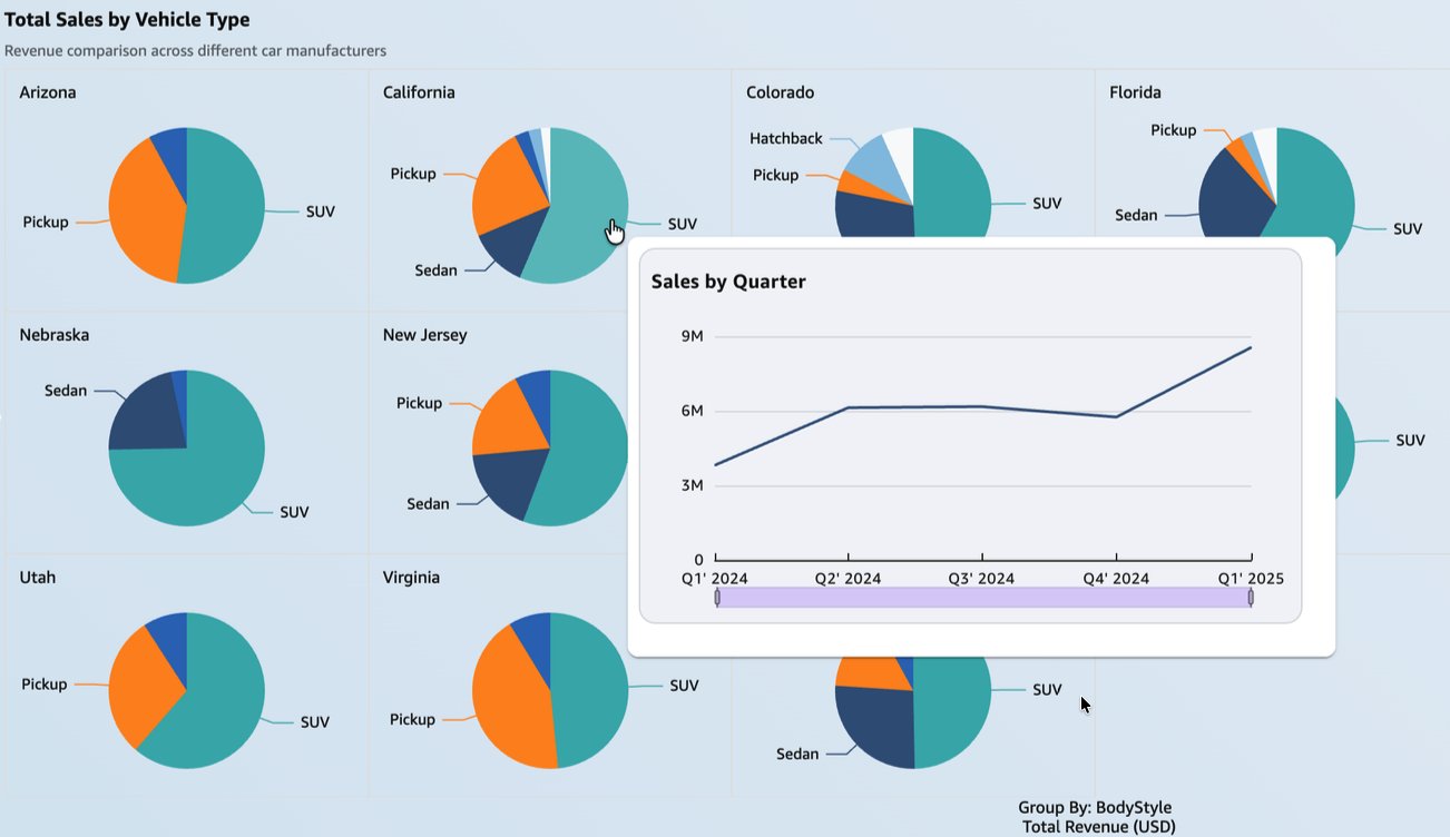
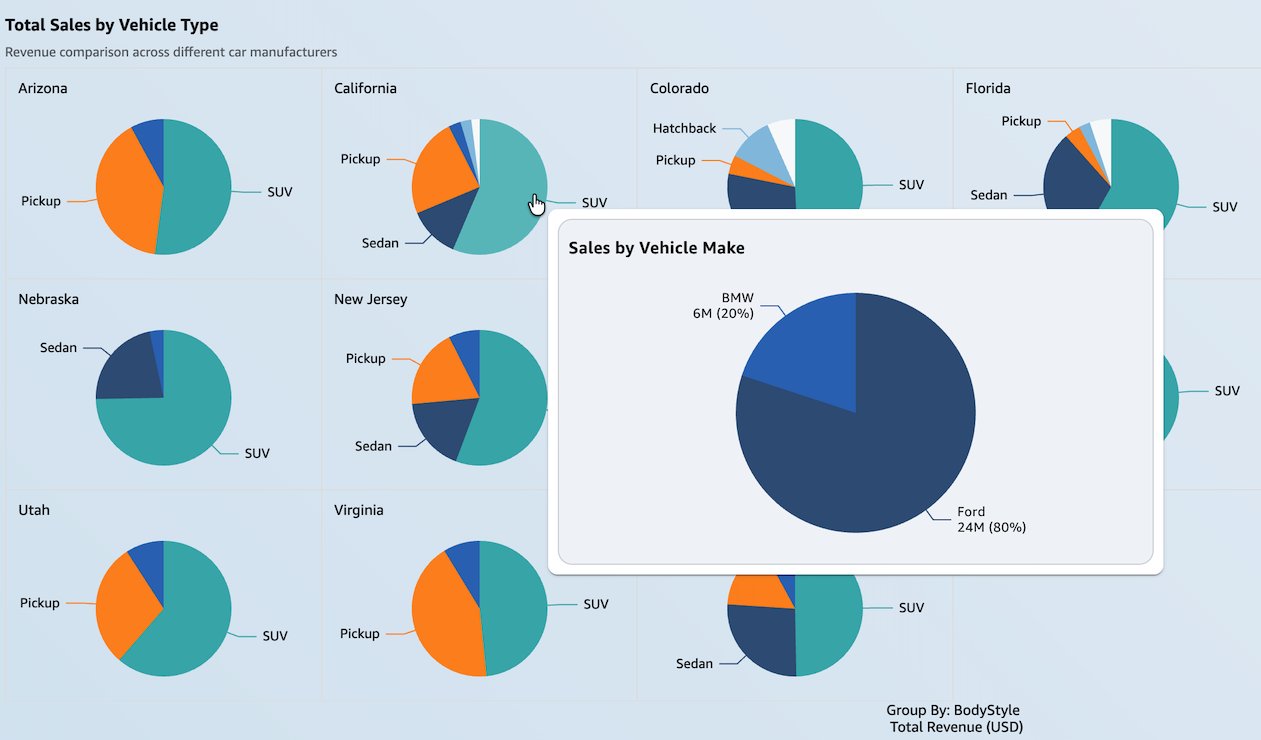
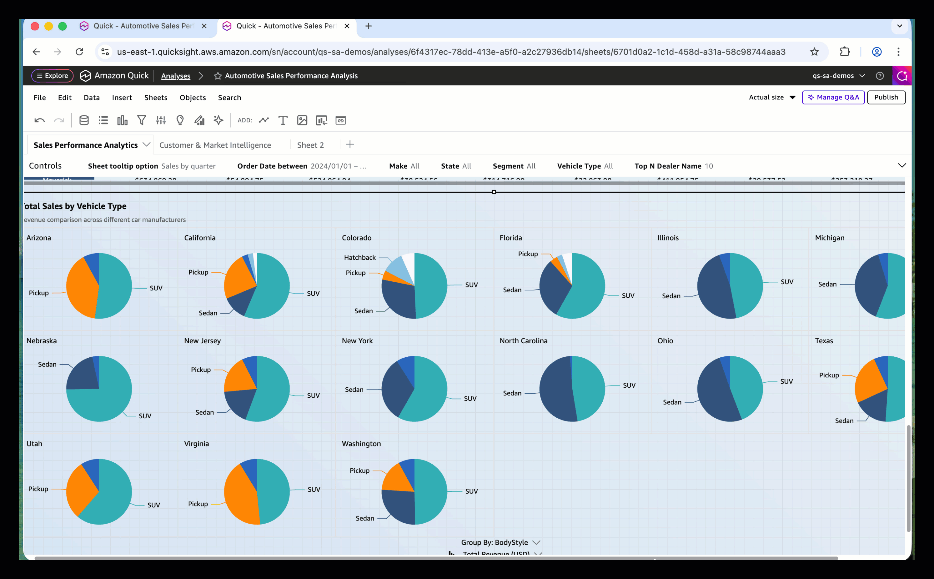
You can also add sheet tooltips to visuals that use small multiples. The fractional multiple feature allows you to compare data across many values of a particular dimension. The following screenshot shows a sheet tooltip that displays quarterly sales on a small multiple pie chart. This view helps readers gain deeper insights, such as vehicle model comparisons across regions and quarterly sales trends.
You can also use parameters to allow readers to dynamically change the visuals that appear in the sheet’s tooltip. In the following example, readers can choose to display sales figures by quarter or car model in the sheet’s tooltip.
Dashboard authors can use parameters to configure previous sheet tooltip options by showing or hiding visuals in quick sites. For more information, see Use Quick Sight parameters and controls to increase dashboard interactivity and Hide visuals by default.
The following video shows how to configure Quick Sight so dashboard readers can toggle sheet tooltip visuals.
Sheet tooltip limitations
When exploring the sheet tooltip functionality, be aware of the following current limitations:
- You cannot add sheet tooltips to certain visual types. See the list below.
| Visual types cannot contain sheet tooltips | |||
| KPI | waterfall chart | sankey diagram | radar chart |
| word cloud | custom visuals | high chart visual | insight |
- Each tooltip sheet supports up to 5 visuals, 5 images, and 5 text boxes.
- Each analysis supports up to 50 tooltip sheets. This limit is separate from the limits for interactive report sheets and pixel-perfect report sheets.
- An analysis must include at least one interactive or paginated report sheet. Tooltip sheets cannot be the only sheet type in an analysis.
- Sheet tooltips are not supported on pixel-perfect report sheets because the report is a static PDF output.
- Layered map visuals are not supported in tooltip sheets.
- Sheet title and description are not available in tooltip sheets.
- Cross-sheet filtering is not supported on tooltip sheets.
- Sheet tooltips use free-form layout and support a maximum width of 640 pixels and height of 720 pixels.
- The visual import feature cannot import sheet tooltips from another analysis.
- You cannot add custom actions to visuals in tooltip sheets.
conclusion
Sheet tooltips in Amazon Quick Sight enhance the dashboard creation experience, giving authors creative freedom to design rich multi-visual tooltip layouts that display detailed data on hover. By combining dynamic charts, real-time metrics, and flexible free-form layout, sheet tooltips transform hover interactions into an interactive data exploration experience. Whether you’re building an executive dashboard, a sales report, or an operational monitoring view, sheet tooltips allow readers to gain deeper insights without moving out of their current context.
To learn more about sheet tooltips and other new features, visit the What’s New section of the Amazon Quick Community. We look forward to seeing the creative tooltip experiences you build.
About the author